a butcher’s word for a collector’s colour
red, burgundy and oxblood behave like three different characters on the hand; here is how they differ, and which suits your skin.
the short answer
red is bright and saturated, leaning cool like cherry or warm like tomato. burgundy is darker, with a purple, wine-like cast. oxblood is darker still and tilts towards brown, so it behaves almost like a neutral. cool undertones usually suit cherry and burgundy, warm undertones suit tomato and oxblood, and neutral skin can wear all three.
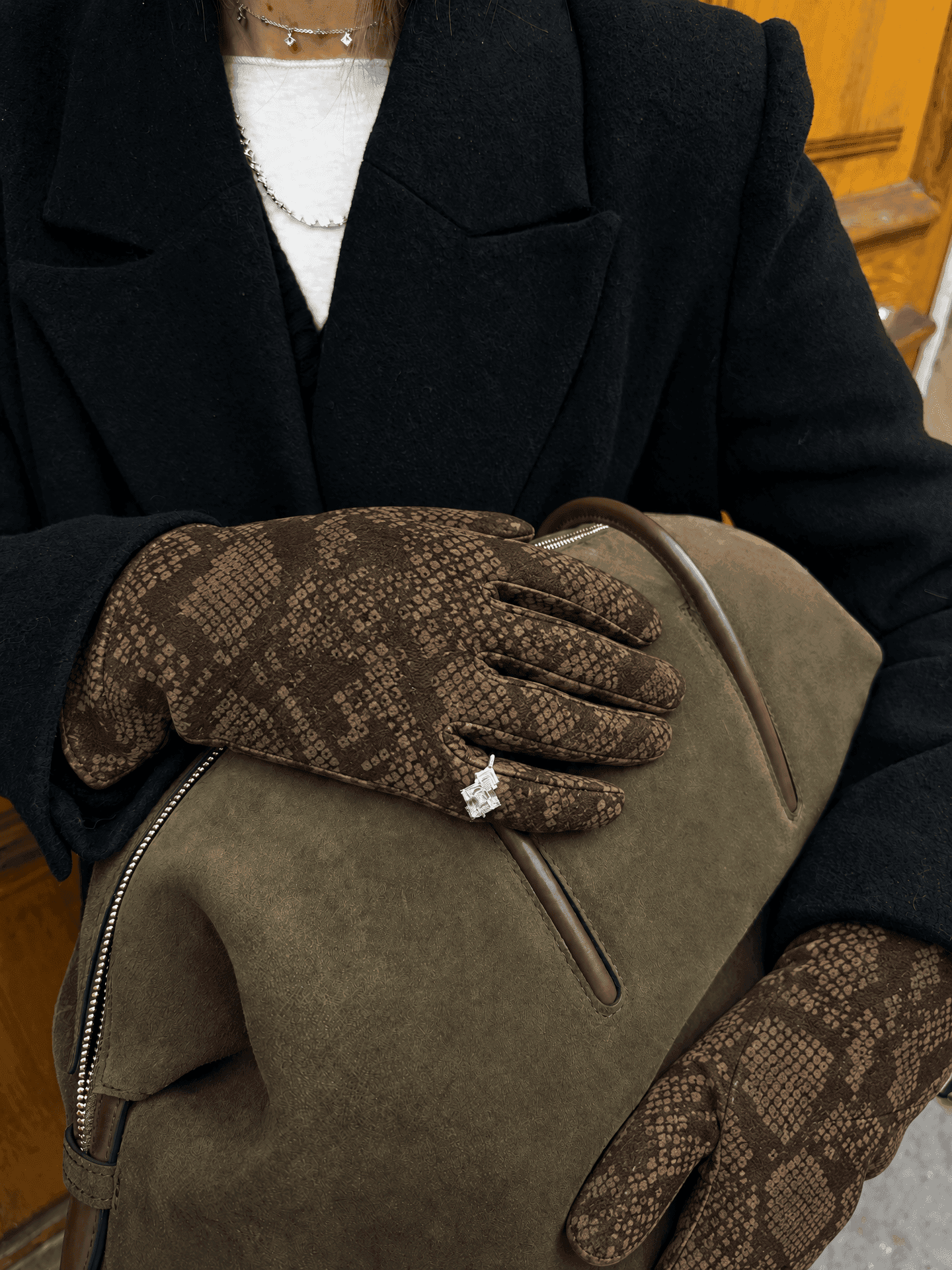
oxblood is a butcher’s word for a collector’s colour. burgundy borrows its name from a wine, and red, plain red, has been fought over by empires. the three sit side by side on a colour card and look like gradations of one idea, but on the body they behave like different characters, and the hands are where you notice it first.
in the question of red vs burgundy vs oxblood, the short version is this. red is bright and saturated, and can lean cool, like cherry, or warm, like tomato. burgundy is darker, with a purple, wine-like cast. oxblood is darker still and tilts towards brown. cool undertones usually suit cherry and burgundy. warm undertones suit tomato and oxblood. neutral skin can wear almost all of them.
red, the colour people fought for
for most of history a truly vivid red was difficult and expensive to make. the richest came from cochineal, a tiny insect that lives on the nopal cactus, which spanish conquistadors encountered in mexico in 1519. amy butler greenfield tells its story in a perfect red, and publishers weekly’s review1 of the book sums up the stakes: a dye that gave the “brightest, strongest red the old world had ever seen”, and a spain that “fiercely guarded the secrets of cochineal cultivation” to protect its trade. red cloth became the possession of kings and cardinals.
something of that status still clings to clear red. it is the most visible of the three by a distance, and the one that looks most like a decision. in fashion, “red” usually means one of three things: a cool cherry with a hint of blue, a balanced true or lacquer red, or a warm tomato or poppy with a little orange. each wants a slightly different coat and a slightly different skin.
burgundy, the formal one
burgundy takes its name from the french wine region, and it shares the qualities of a good glass of its red: depth, a purple edge in the light, a certain gravity. it reads as rich and slightly formal, and it sits comfortably with navy, grey and black, which is why it so often turns up in tailoring.
at the hands, burgundy is quieter than red. against a dark coat it reads as depth rather than contrast. that makes it useful for people who want colour without the sense of being looked at, and less useful for anyone after the jolt a clear red gives.
oxblood, the one that ages
oxblood is very dark, with brown in its undertone, and it has a long life in leather goods, from brogues and belts to briefcases, because it looks better with polish and wear. it has a parallel life in ceramics. the copper-red chinese glaze known in french as sang de boeuf, ox blood, emerged in the early eighteenth century at the imperial kilns, and a qing bottle vase at the worcester art museum2 shows what the colour can do: a deep, dense, glassy red that seems to sit beneath the surface rather than on it.
that is a fair description of good oxblood leather, too. it behaves almost like a neutral and, in many outfits, almost like brown. it suits camel, olive, chocolate and tweed, and it will not give you the pop of cherry. what it gives instead is the look of something that has been worn and cared for.
red vs burgundy vs oxblood, side by side
| red (cherry to tomato) | burgundy | oxblood | |
|---|---|---|---|
| depth | light to medium | dark | very dark |
| leans | blue or orange | purple | brown |
| visibility | high | medium | low, close to neutral |
| mood | graphic, confident | rich, formal | heritage, bookish |
| best coats | black, grey, navy, cream | grey, navy, camel | camel, brown, olive, black |
reading your undertone
undertone is the colour beneath the surface of the skin, and it does not change with a winter pallor or a summer tan. none of the usual tests is infallible, but together they give a reliable hint.
look at the veins on your inner wrist in daylight. blue or violet suggests cool; greenish suggests warm; hard to say suggests neutral. then think about metal. if silver makes your skin look clearer, you are probably cool. if gold does, probably warm. pure white against the face tends to flatter cool undertones, and cream tends to flatter warm ones. skin that burns pink is more often cool, and skin that tans golden is more often warm.
cool undertones look clear and bright in blue-based reds, cherry and raspberry, and in burgundy. oxblood can look slightly muddy on cool skin unless it leans more red than brown. warm undertones come alive in tomato, poppy, brick and oxblood, while very blue reds can make them look sallow. neutral skin is the luckiest. a balanced true red is the safest choice, and all three will usually work. deep skin tones carry saturated reds of every temperature beautifully, with cherry and true red at their most vivid and oxblood at its most elegant. very fair skin is often happier in cherry or burgundy than in a bright tomato, which can overwhelm it.
test it where you will wear it
theory is a starting point, not a verdict. with gloves, the test is simple. put one on, stand by a window in daylight, and hold your hand near your face. then look at the glove where it meets the wrist. if your skin looks lively and even, the colour agrees with you. if it looks grey, ruddy or tired, try a shade warmer or cooler.
then hold it against your coat. a burgundy glove that flatters your skin may disappear against a navy coat. a cherry glove will be visible against any dark coat, which is exactly the point if you want the red to be seen. depth and temperature first, fashion second. wutong makes no red glove, but the same rule applies to the colours it does make: its plum python-print suede gloves share burgundy’s purple depth, and its brown python-print suede behaves much as oxblood does, as a dark near-neutral.
there is a red for every skin and every wardrobe, and the pleasure is in finding yours. for the case for colour at the hands generally, read our guide to colourful gloves.
quick answers
- is burgundy the same as maroon?
- they are close relations. maroon tends to be browner and a little duller, while burgundy leans purple. oxblood is nearer to maroon than to burgundy.
- does oxblood count as red?
- technically, yes. in styling it behaves like a dark neutral, closer to brown than to cherry, and it will not give an outfit a bright accent.
- which red is the most versatile for gloves?
- a balanced true red works for the widest range of undertones and coats. if you own mostly black and grey, a cherry is a close second.
the gloves in this piece
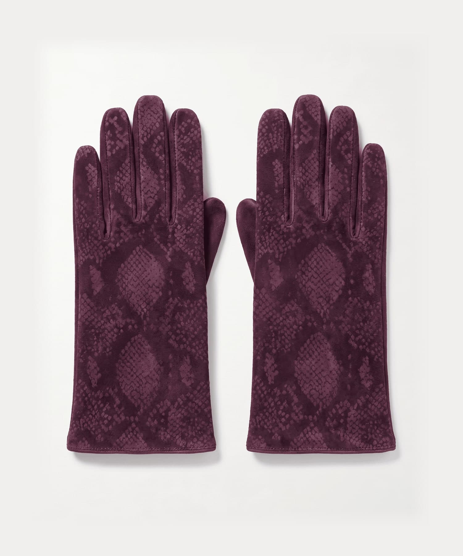
005 plum python-print suede gloves£120
plum suede with python print
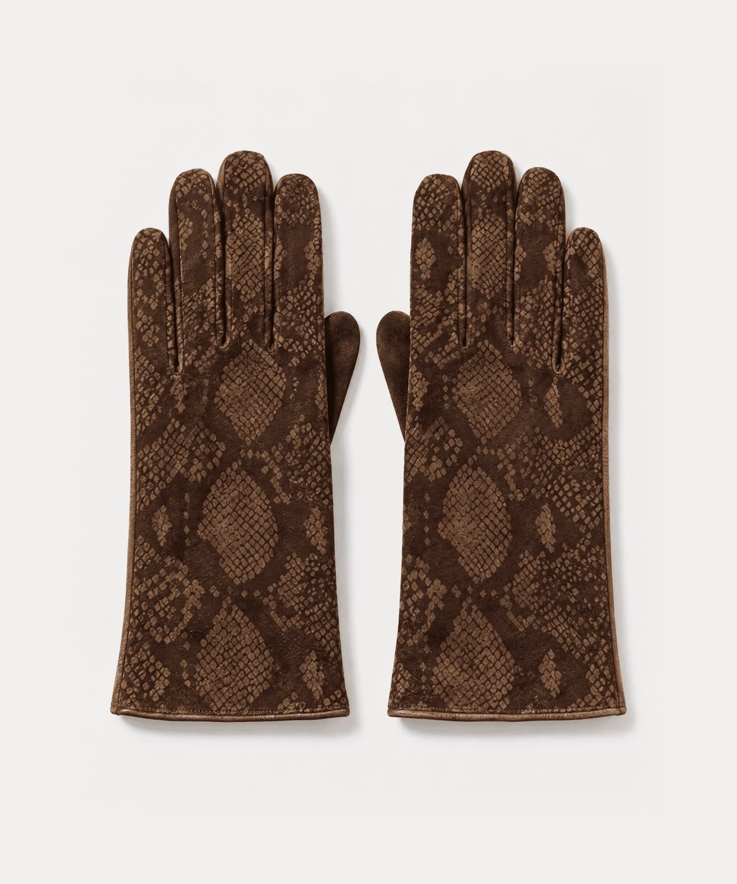
006 brown python-print suede gloves£120
brown suede with python print
every style is size 7 and ships tracked from the uk, free to uk addresses, with returns accepted within 14 days of delivery. delivery & returns
keep reading
sources
- Publishers Weekly, A PERFECT RED: Empire, Espionage, and the Quest for the Color of Desire by Amy Butler Greenfield
- Worcester Art Museum, Dark oxblood red bottle vase