in praise of the stray note
where the unexpected red theory began, why one unmatched red wakes everything around it, and how to wear it this winter in leather gloves.
the short answer
the unexpected red theory, named on tiktok by taylor simon in 20242, says that one red thing which matches nothing makes everything around it look better. keep the red small and clear, cherry or tomato, set it against a quiet coat in charcoal, navy or camel, and don’t repeat it in a scarf or bag.
at the royal academy’s exhibition of 1832, j.m.w. turner found his seascape helvoetsluys hung beside john constable’s the opening of waterloo bridge. the story, as the royal academy tells it1, is that turner looked at his own “cool-toned” sea next to constable’s “scarlet-flecked” thames, then “planted a single daub of red in the sea of his own canvas”, later shaping it into a buoy riding the swell. constable is said to have remarked, “he has been here and fired a gun.”
it is an anecdote, first written down decades afterwards, and it should be enjoyed as one. it is also the neatest demonstration of an idea the internet named nearly two centuries later. the unexpected red theory holds that one red thing, placed where it has no obvious reason to be, makes everything around it look better. turner’s buoy matched nothing in the picture. it made the whole sea look intended.
where the unexpected red theory came from
the phrase belongs to taylor simon, who posts about interiors on tiktok as @intayriors. in february 2024, apartment therapy2 quoted her definition: “adding anything that’s red, big or small, to a room where it doesn’t match at all — and it automatically looks better.” her examples were domestic. a bright red pedestal sink in a blue bathroom. a red frame around an old portrait.
fashion took it up quickly, as fashion does with anything that gives a vague instinct a name. in january this year, marie claire’s bella gerard wrote about a pair of short red leather gloves3, picked up on discount on the first cold afternoon of the previous winter, and what followed: “soon, it was as if the unexpected red theory had infiltrated my wardrobe.” that is how it usually happens. one small red thing, and then you start to see what it does.
why a red that matches nothing works
the usual explanation is contrast, and contrast is part of it. red is the colour the eye finds first in a muted field, so a single red point gives a quiet outfit a centre of gravity. but the more interesting word in the theory is “unexpected”.
a red picked out of a print, a red bag chosen to go with red shoes, a red scarf bought to echo the stripe in a jumper: all of these are coordination. they tell the viewer that the outfit was assembled to a plan. a red that arrives from outside the colour story says something different. it suggests a person who looked at a grey coat and decided, for reasons of their own, that it needed a little heat. that sense of a private decision is what makes the look feel alive.
scale matters too. simon’s sink is small against the room around it, and turner’s buoy is tiny against the sea. the idea falls apart when the red gets too big. a red coat over neutrals is a red-coat outfit. it may be wonderful, but it is no longer an accent. the red has become the subject, and everything else has become its frame.
the case for gloves
of all the places to put the unexpected red, the hands are the most persuasive, and the reason is movement.
a bag hangs. shoes stay on the ground. gloves travel. they rise to turn up a collar, close around a paper cup, push hair back from the face, sketch a point in conversation. the red is never in one place for long, so it reads as animation rather than ornament. it also comes and goes. on in the street, off at the door, laid on a café table beside a glass. the red is present in the cold and withdrawn in the warm, which is about as far from a planned colour scheme as you can get.
gloves also impose their own restraint. they are a small area of colour at the far edge of the silhouette, exactly where the sleeve ends, and that placement keeps them in proportion. a red glove is almost impossible to overdo, as long as you leave it alone.
wearing it this winter
the base matters more than the red. choose a coat that says very little: charcoal wool, navy melton, a black with some depth to it, a long camel cut straight. keep what is underneath in the same register, perhaps a grey cashmere roll-neck with grey flannel trousers, or a black merino knit with dark indigo jeans and a plain black loafer. the quieter the outfit, the more the gloves look like a single deliberate stroke.
then choose the red with some care. a clear, saturated red does the work best: cherry if you like a cool, slightly lacquered colour, a warmer tomato if your coat is camel or chocolate. dusty, faded reds tend to sink into winter wool and lose the snap the theory depends on. smooth leather helps. it holds colour with a faint sheen, so the red catches the light as the hand turns, and the surface looks finished at close range, which is where gloves are always seen.
what you leave out matters just as much. skip the red scarf, which sits too near the hands and turns two good accents into a set. skip the red bag for the same reason. if you want a second red, put it far away and keep it small, a red lip perhaps. and steer clear of prints. a bold check gives the eye too many places to rest, and the red loses its job as the one note that does not belong.
beyond red
nothing in the theory is really specific to red. it describes a principle painters and decorators have used for as long as they have worked with colour: a calm field and one saturated interruption. red is simply the easiest colour to begin with, because we are used to seeing it in small doses. a red lip, a red nail and a red shoe have been finishing otherwise sober outfits for most of the past century.
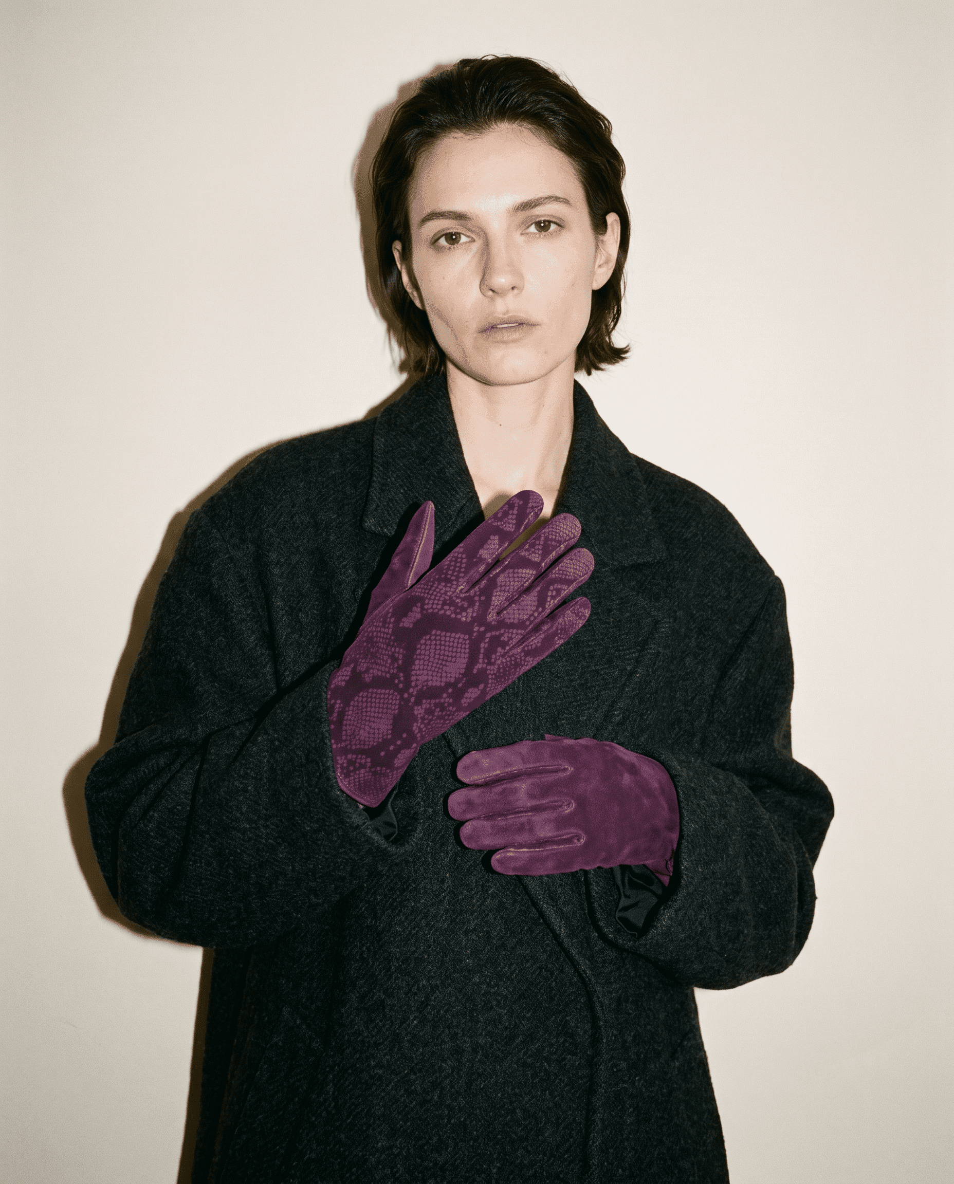
once you have tried it with red, try it with something else. a cobalt glove under a camel coat does much the same thing, and so does a deep green against grey flannel. wutong makes no red glove, but its deepest colour, plum, works on the same principle: one saturated note at the hands against a winter wardrobe that keeps quiet.
if you would like to try the theory at the wrist, choose the brightest colour you dare, and wear it with the plainest coat you own. wutong’s deepest colour is plum, in its plum python-print suede gloves.
quick answers
- does the red have to clash?
- it does not have to clash, but it should not be drawn from the outfit’s own palette. if your gloves pick up the red in your scarf’s pattern, you are coordinating, which is perfectly pleasant and a different idea. the theory depends on the red feeling independent of everything else you are wearing.
- can burgundy or oxblood work instead?
- they can, but the effect is gentler, as the guide to red vs burgundy vs oxblood explains. deep reds settle into dark winter fabrics and start to behave like neutrals. if you want the jolt the theory describes, choose a clearer red and set it against something cooler or darker than itself.
- is it just a passing trend?
- the name may fade. the instinct behind it is much older than tiktok, as turner’s buoy suggests, and it will outlast the hashtag.
the gloves in this piece
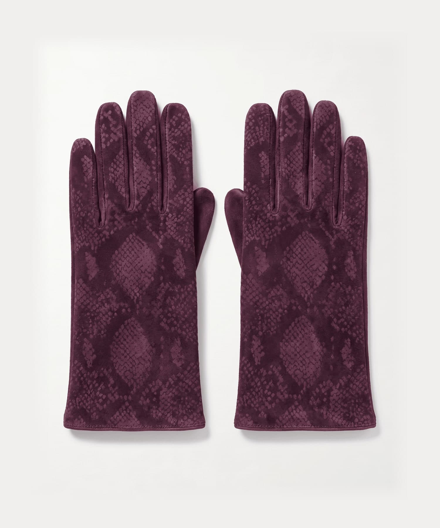
every style is size 7 and ships tracked from the uk, free to uk addresses, with returns accepted within 14 days of delivery. delivery & returns
keep reading
sources
- Royal Academy of Arts, Turner, Constable and the Royal Academy
- Apartment Therapy, The Viral “Unexpected Red Theory” Is the Secret to Styling This Controversial Color, 3 february 2024
- Marie Claire, If You Buy One Accessory For 2026, Make It a Pair of Statement Gloves, 16 january 2026